

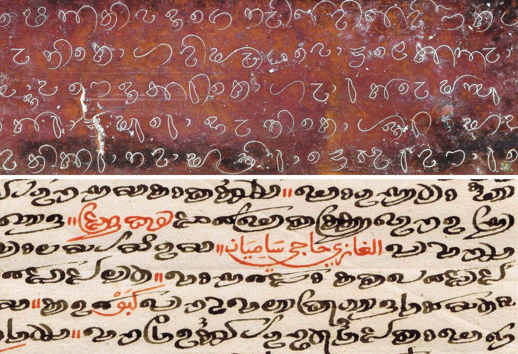
Dhives Akuru was a writing system used in the Maldives for over twelve centuries before falling into disuse in the 20th century and replaced by Thaana. The script’s transformation, leading to its eventual substitution, can be traced back to the 12th century when the country embraced Islam, starting with contact with Arab traders in the Indian Ocean. In the 16th century, Dhives Akuru had begun to be written alongside Arabic, and the former’s appearance changed significantly. The use of the reed broad nib pen, traditionally employed for the Islamic script, resulted in the Maldivian letters becoming wider, as featured by elongated ending strokes. This represents a rare instance in history where an Indic script had been influenced by Arabic. These changes made the forms of the letters so distinct from earlier ones that H.C.P. Bell, one of the first scholars to study writing forms of the Maldives in the 19th century, decided to differentiate them by introducing the categorizations of Evela Akuru and Dhives Akuru (Figure 1).[1]
Despite Dhives Akuru’s long existence, the writing system is relatively unknown both within and outside the Maldives. Additionally, the preservation of its records is threatened by both natural hazards and human vandalism. In 2012, vandals invaded the National Museum of the Maldives and attempted to destroy a number of pre-Islamic artefacts, including 9th-century statue with Dhives Akuru inscriptions. More broadly across the archipelago Maldivian heritage including texts written in Dhives Akuru are threatened by accelerating climate change. Fortunately, the subject has recently begun to attract the interest of scholars, which is helping to keep knowledge of the script alive. Efforts to digitally record and preserve texts in Dhives Akuru is being undertaken by the Maritime Asia Heritage Survey (MAHS), which has published a large number of manuscripts and stone inscriptions on its open-access online archive.[2]
In 2021 I started a post-master research project at the Atelier National de Recherche Typographique in Nancy, France with the aim of designing a font for Dhives Akuru.[3] The project is a part of the wider initiative called Missing Scripts, which seeks to create fonts for writing systems that lack typographic representation.[4] The main goal of my project was to contribute to the preservation of the Maldives’ cultural heritage by creating a representation of the script that does not rely on the materiality of artefacts and can be easily disseminated in the digital medium.
Due to limited access to the original manuscripts, the primary source of research included 45 digital documents available on the MAHS platform, which has been an indispensable resource for my project. The variety of these sources has been important for obtaining an overview of the possible forms of Dhives Akuru, as well as selecting the best samples for the typographic project. The availability of high-resolution images was also crucial to the work of identifying details, which have been essential for making accurate representations of the letterforms. These images provided a better understanding of the writing movements. I was thus able to determine, for example, that despite the initial impression that these letters were quickly written without lifting one’s pen from paper, closer examination revealed that the script has discontinuous strokes and the writings were composed in parts in many cases. This evaluation of the existing forms enabled a greater degree of precision in reproducing the letterforms.
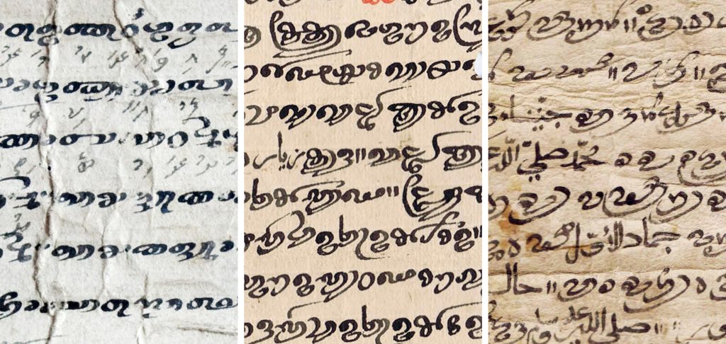
The design of an extinct script’s font entails a number of challenges. The first would be how to define the main references for the design of the letters. Over centuries, Dhives Akuru had exhibited a wide variety of styles, from more stable and uniform shapes to dynamic arrangements with expressive long outstrokes (Figure 2). In this type of project, which aims to be as representative as possible of its manifestations, it is a crucial question to determine which of these forms to display. To answer this question, a classification process was carried out to uncover the dominant style and a close approximation of the average expressions regarding Dhives Akuru’s existing manuscripts. This is important because once the project becomes complete and the digital files are easily accessible to everyone, the font would be generally understood as a synthesis of its forms and tend to become its main representation.
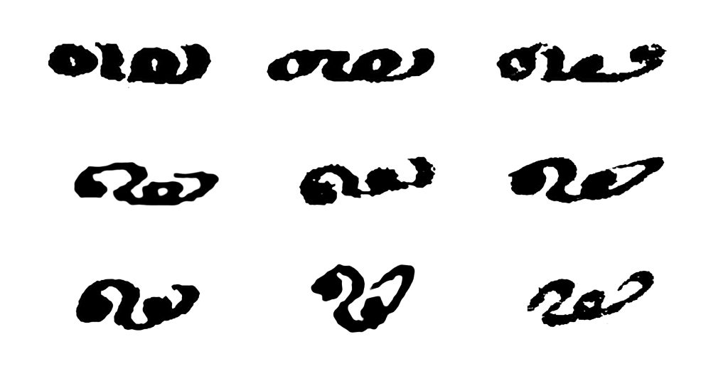
Figure 3: The letter ‘dha’ extracted from nine distinct manuscripts shows the possible ways of writing the same letter. (MAHS-MDV-COL-003-O-0127 / MAHS-MDV-COL-003-O-0117 / MAHS-MDV-COL-003-O-0118 / MAHS-MDV-COL-003-O-0015 / MAHS-MDV-COL-003-O-0168 / MAHS-MDV-COL-003-O-0009 / MAHS-MDV-COL-003-O-0215 / MAHS-MDV-COL-003-O-0008 / MAHS-MDV-COL-003-O-0179)
An illustrative example of divergent characteristics identified during the classification process are the circular dots, which are a prominent feature in some manuscripts, while the same element is represented by large rings in other documents (Figure 3). More variations of the Dhives Akuru letters have been observed by this study, which include how stable or variable is the height of the letters, whether the letters are predominantly upright or oblique, and the position of the pen that determines which strokes are thick and thin. By analysing these features, this study categorized four style groups of the manuscripts with common characteristics. These analyses then provided guidelines for the execution phase.
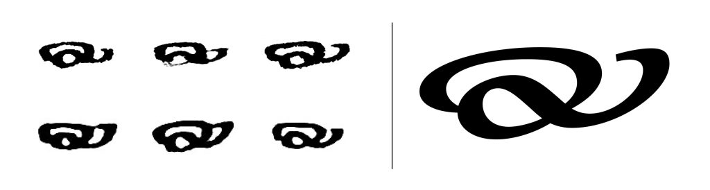
The next phase’s objective was to develop a methodology to transform the calligraphic shapes into typographic ones. Designing a font for an extinct script differs from a standard font design project, with less room for proposing new forms, since it is important to maintain a connection with the original sources as much as possible. Therefore, this project had explored various approaches, and the one considered to best preserve the qualities of Dhives Akuru was selected. Instead of relying on one example of each letter as the basis for the digital drawings, multiple writings were referenced (Figure 4). This approach avoided reproducing eventual imperfections inherent in the writing process and aimed for the most refined result possible based upon a known range of historical forms.
The project’s outcomes were presented at the Atelier National de Recherche Typographique in March of this year, together with an outline of a methodology for designing fonts for extinct scripts.[6] Despite the significance of the subject, little documentation regarding the particularities of this process exists. Although what this research investigates is specific to one writing system, the methodology can be replicated for other extinct scripts that have not been translated into typography. While the proposed method yielded the desired results, the font project is yet to be completed (Figure 5). As a form of Brahmi script, Dhives Akuru contains numerous ligatures, which are combinations of letters that require individual designs. Identifying the elements constituting these ligatures would necessitate the assistance of readers proficient in the script. Currently, the project is seeking support for the final stage of work, which we hope to be able to complete soon.
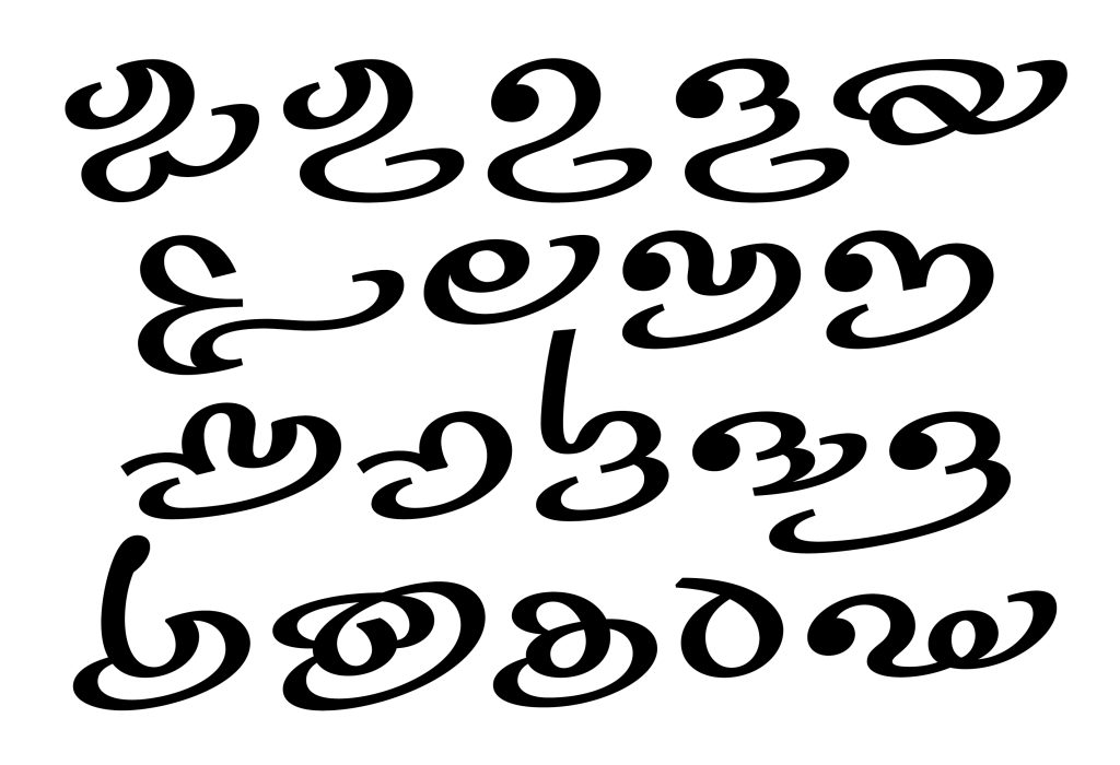
Figure 5: The Missing Scripts Dives Akuru Project is currently in progress.
Fernando Caro is a graphic designer interested in multi-script typography. After graduating in Brazil, he worked in newspapers, magazines and design studios before concentrating on creating typefaces. In 2011, he joined the British type foundry Dalton Maag, where he worked on projects with several writing systems. After this professional experience, he enrolled in the research programme at the Atelier National de Recherche Typographique in Nancy, France, to study the forms of Dhives Akuru and develop a typeface in the script. In addition to his research and practice in the field, he teaches graphic design to undergraduate and graduate students at Ensad Nancy, France.
[1] Bell, H.C.P. “The Old and Modern Maldivian Alphabets”. Máldivian Linguistic Studies,Journal of the Ceylon Branch of the Royal Asiatic Society Vol. XXVII – Extra Number, Appendix C (1919): 149–167.
[2] R. Michael Feener (Ed.), Maritime Asia Heritage Survey: https://maritimeasiaheritage.cseas.kyoto-u.ac.jp
[3] Caro, Fernando. The Missing Scripts 2021: Dives Akuru: The role of typography in cultural preservation. The Atelier National de Recherche Typographique (ANRT), the École nationale supérieure d’art et de design, 2021. https://anrt-nancy.fr/en/projets/the-missing-scripts-2021-dives-akuru.
[4] Bergerhausen, Johannes. The World’s Writing Systems, 2022: https://www.worldswritingsystems.org.
[5] MAHS-MDV-COL-003-O-0127 / MAHS-MDV-COL-003-O-0215 / MAHS-MDV-COL-003-O-0179
[6] A Final Presentation, the Atelier National de Recherche Typographique (ANRT), the École Nationale Supérieure d’Art et de Design, March 2023: vimeo.com/showcase/10302787